Is Target Open on the 4th Of July? Details on Walmart, Costco, and More Holiday Store Hours
With Independence Day falling on a Friday this year, holiday schedules for major retailers vary, and shoppers should take note before heading out.
As Americans gear up for Fourth of July celebrations, many are finalizing their shopping plans. Whether for a backyard barbecue or last-minute errands, knowing which stores are open can save time and effort. Here is a breakdown of major retailers’ operating hours for July 4, 2025.
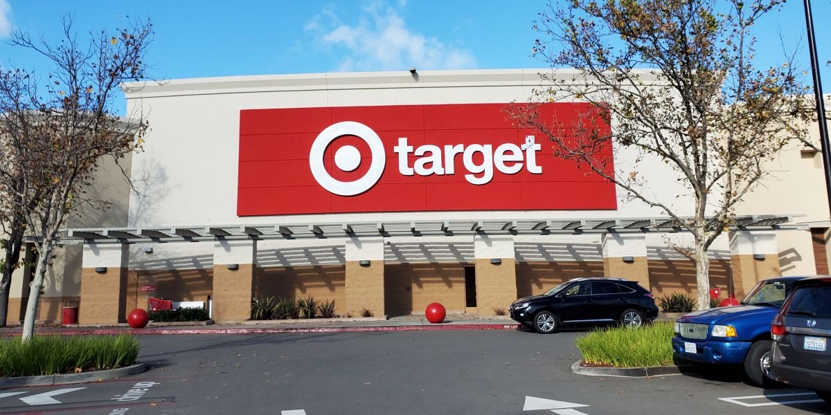
Target stores will be open on Independence Day. Shoppers can visit from 8 a.m. to 10 p.m. However, it’s recommended to check with local branches, as hours may vary by location.
Walmart will maintain its regular schedule on the holiday. Doors will open at 6 a.m. and close at 11 p.m., allowing customers plenty of time to grab any essentials.
Costco will be closed on July 4 in observance of the holiday. The wholesale club will resume operations on Saturday, July 5, during its usual business hours, which vary by location.
Trader Joe’s will operate with reduced hours. Stores will open at 8 a.m. and close early at 5 p.m., so customers are advised to plan their visits accordingly.
Most Kroger stores will remain open on July 4. This includes affiliated banners such as Ralphs, Fred Meyer, King Soopers, and others. While most locations will be operating, checking the hours for individual stores is encouraged.
Publix will be open on the holiday. According to its website and weekly flyers, stores will follow regular hours from 7 a.m. to 9 p.m.
As Independence Day celebrations continue across the country, being aware of store hours can help keep the day running smoothly. Whether picking up forgotten ingredients or stocking up for gatherings, customers can rely on several major retailers to stay open during the holiday.
While shoppers can take advantage of extended store hours this holiday, one major retailer had already made headlines earlier this year (January 2025) for a different reason — a bold update to its brand identity.
Seventeen years after changing its brand identity, Walmart underwent another brand update by refreshing its well-known wordmark and logo. Despite the company executives explaining why they did it and what the slight change entailed, social media followers were divided in their opinions on the appearance of the refreshed look.

User comment about Walmart’s refreshed logo and wordmark, posted on January 14, 2025. | Source: X/@FurryNonsense1
In an announcement on its corporate website, the company described the new look as a “testament to heritage and innovation,” aimed at reflecting its evolution as a tech-powered omnichannel retailer while staying true to its roots.
The updated wordmark, showcased on the company’s website, draws inspiration from founder Sam Walton’s classic trucker hat, featuring a custom modern font that gives Walmart a distinct identity.
Paired with the recognizable Spark symbol — which the company says embodies the energy of the Walmart experience — the refreshed design stays true to Walmart’s core identity while adding a modern twist.

A Walmart hat with the refreshed wordmark, photo taken in 2025. | Source: Walmart Press Center
The new color palette, a vibrant combination of True Blue and Spark Yellow, pays homage to Walmart’s long-standing association with the color blue while introducing fresh, contemporary touches.
In explaining the rationale behind the redesign, Walmart emphasized its commitment to making the shopping experience more delightful for customers across all channels.
The refresh is part of a broader initiative to strengthen the company’s connection with its customers and highlight its growing focus on digital services, health offerings, and sustainability.
Walmart’s updated brand identity has already been rolled out across various channels. Newly designed storefronts, packaging, and digital platforms now sport the updated wordmark and logo, creating a unified and recognizable visual identity.
According to Walmart’s rollout plan, the refreshed look was first introduced in stores in October 2024, starting with Store 4108 in Springdale, Arkansas, and will continue to be implemented across locations throughout 2025.
Customers also experienced the revamped look on Walmart’s app, website, and new brand hub in January 2025.

The Walmart app with the refreshed logo and colors, taken in 2025. | Source: Walmart Press Center
The company’s Chief Marketing Officer, William White, highlighted that the updated identity helps Walmart communicate its relatable and approachable brand tone while solidifying its position as a modern, culturally relevant retailer.
“As our customers evolve, we will too. Our Walmart will always be their Walmart, and our brand will always be a testament to how we innovate and change alongside them,” penned White in a statement he shared on LinkedIn.
He concluded, “A massive thank you to our internal creative team, Walmart Creative Studio, Jones Knowles Ritchie and other external partners including Landor and Publicis Groupe on the development and rollout of the refreshed brand.”
The nuances behind Walmart’s refreshed logo reflect a careful balance of heritage and modernity, as detailed in the company’s official brand guidelines. The Spark, Walmart’s primary logo, remains the most iconic symbol of the brand.

The refreshed Walmart Spark, taken in 2025. | Source: Walmart Press Center
First introduced in 2008, it has been subtly refined to feature softer, more organic curves, making it feel more approachable and less rigid. Walmart describes the Spark as a visual shorthand for its identity, radiating energy and optimism wherever it appears.
It represents the retailer’s promise to deliver convenience and positivity to its customers across all platforms.

Before and after photos of Walmart’s Spark in 2025. | Source: Walmart Press Center
While the Spark can stand alone in various applications, Walmart emphasizes that it should never be placed next to the wordmark. When paired, both elements must maintain clear spacing to ensure visual clarity and brand consistency.
The company also provides strict guidelines on color usage, with the spark primarily appearing in its signature Spark Yellow on a True Blue or white background.
In smaller-scale uses, such as app icons or digital pins, the Spark is displayed in contrasting color combinations to maximize visibility and legibility.
Meanwhile, Walmart’s wordmark serves as the brand’s secondary logo and was inspired by Walton’s iconic trucker hat from the cover of his autobiography “Made in America” — a nostalgic nod to the company’s roots in Bentonville, Arkansas, in 1951.
However, this isn’t just a standard typeface. The wordmark has been custom-designed to differentiate Walmart from competitors, making it a distinct and ownable element of the company’s visual legacy.

Walmart’s refreshed wordmark, 2025. | Source: Walmart Press Center
According to Walmart, the wordmark must always be used with the Spark and can’t stand alone in any application. This ensures a cohesive brand presence across all touchpoints, from storefront signage to digital platforms.

The storefront of a Walmart shop with the company’s refreshed logo and wordmark, taken in 2025. | Source: Walmart Press Center
The brand guidelines also outline specific sizing rules for both logos. Walmart enforces minimum size requirements to preserve legibility, with the Spark needing to be at least 16 pixels high in digital applications or 0.25 inches high in print.
Similarly, the wordmark comes in two variations — a standard size and a small-use version optimized for legibility at smaller scales.

A shopping cart positioned in front of a Walmart sign in Krakow, Poland on January 6, 2025. | Source: Getty Images
Walmart is firm in its stance that these versions are not interchangeable, instructing designers to use the standard wordmark by default and only resort to the small-use version in specific cases.
The company has also thought through how its logos will appear on merchandise. For items like pins, patches, or stickers, the brand employs holding shapes to ensure the logos maintain their integrity when die-cut or molded.

A photo of the Walmart wordmark and logo on a smart phone in Reno, US on December 20, 2024. | Source: Getty Images
These holding shapes are designed to frame the logos effectively, ensuring they remain recognizable and iconic across various formats. Walmart’s brand refresh hasn’t gone unnoticed online, sparking a wave of divided reactions from social media users, who shared their unfiltered thoughts on the update.

People wearing Walmart apparel and carrying Walmart tote bags with the refreshed brand look, taken in 2025. | Source: Walmart Press Center
A vocal critic of the refresh remarked, “The head of their branding should be fired. This is a joke,” while another dissatisfied observer added, “Thats it? Whoever designed the new ‘rebrand’ should be sued. Its basically the same.”

A smartphone displaying the Walmart logo in India on December 14, 2024. | Source: Getty Images
“And they paid for that? Lmaooo [sic],” wondered a netizen. Another expressed, “Wow. How many millions did that cost?” A disappointed user lamented the redesign of the Spark logo, “NOOO THEY RUINED THE WALMART LOGO 💔💔💔” which they accompanied with side-by-side images of the past and present logo.
One netizen joked, “Walmart’s new logo is a BOLD move 😂” alongside before and after images of Walmart’s wordmark. However, not all comments were negative.

Before and after photos of Walmart’s refreshed wordmark, 2025. | Source: Walmart Press Center
Another voiced support for the updated color scheme, saying, “unironically prefer the new blue good change [sic].” “Feels brighter and fresher!” remarked a supporter. Meanwhile, someone else opined, “The attention they’re getting for the rebrand was worth whatever they paid.”
Walmart’s EVP & Chief eCommerce Officer, Tom Ward, took to LinkedIn to express his excitement over the company’s brand refresh. In his statement, Ward shared, “🎉Exciting news🎉 This morning, we unveiled a fresh, new look for Walmart, reflecting Walmart’s evolution as a people-led, tech-powered omnichannel retailer.”
Following suit with what was described on the company’s website and White’s reflections, Ward framed the updated look as a natural progression of the retailer’s ongoing evolution.
In closing, he stated, “Congrats to all the teams who worked on this! 👏,” signaling his appreciation for the work that went into crafting the new visual identity.
Speaking about the brand update to Fortune, Walmart CMO White explained, “I wouldn’t call this a rebrand, but really a refresh to reflect who we are today.” He also noted that the Walmart of 2025 vastly differs from the retailer’s identity in 2008 when the company last made significant changes to its brand.

Shoppers waiting in line outside a Walmart store in Mountain View, California on November 29, 2024. | Source: Getty Images
Addressing the intentional adjustments made to the spark logo, White disclosed, “The changes are meaningful in terms of giving a little bit more life and energy to the spark, making it richer and fuller and giving it more depth.”